HotelTravel.com · Conversion UX
Redesigning a booking page for people who already decided
High-intent travelers were landing on a page built for browsing. We rebuilt it around verification, tested every change live, and moved conversion without breaking a 300,000-page system.
Impact
A 2 to 3 percent lift in PDP-to-booking conversion in key markets, delivered through phased A/B testing across 11 languages, including RTL, without a full rebuild of a 300,000+ page platform.
Company
HotelTravel.com, a global hotel booking platform handling 1,000 to 1,500 daily reservations across multiple markets.
Users
International travellers, primarily from Europe, Japan, and Australia.
Focus
Conversion optimisation and decision clarity at the hotel detail page.
Role
Team Lead UX/UI. Led the redesign end-to-end, from analytics-driven problem framing through phased A/B rollout and frontend implementation.
Timeline
2014 to 2016, Phuket, Thailand.
Context
HotelTravel.com was a global hotel booking platform based in Thailand, serving travellers across multiple international markets.
At the time of the redesign, the platform handled around 1,000 to 1,500 daily reservations and supported 11 languages, including Arabic with right-to-left layout requirements.
A large share of traffic came through partner and travel discovery platforms such as TripAdvisor and KAYAK. Many users arrived directly on hotel detail pages with strong intent to verify information and complete a booking.
This made the hotel detail page one of the most important decision points in the booking journey.
The Challenge
Traffic was strong, but conversion performance showed clear friction across the booking journey.
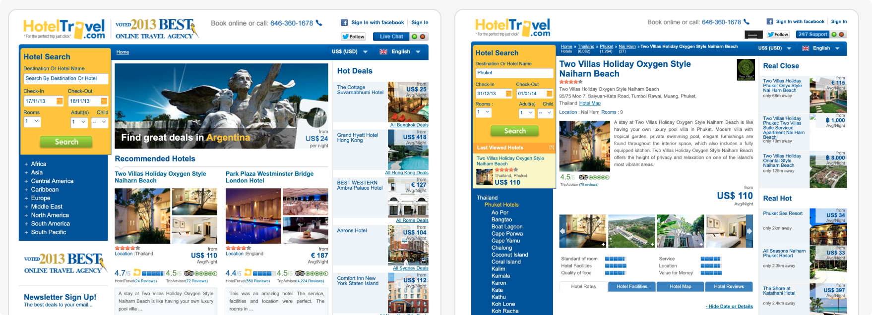
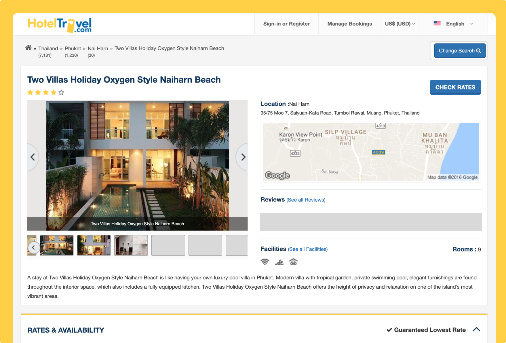
The hotel detail page had gradually evolved into a content-heavy browsing experience, while a large portion of users were arriving with high intent, ready to verify and book. The experience didn't match their mindset.
At the same time, the scale of the platform added its own complexity. The site included 300,000+ pages, heavily driven by SEO and dynamic content generation, so a full redesign risked traffic, revenue, and search visibility.
- —11 languages, including RTL layouts, with content structure and hierarchy varying across markets
- —A large share of traffic landing directly on hotel detail pages from partner platforms
- —Pricing, room options, cancellation details, and location information that needed to be easier to compare
- —Large-scale dynamic page generation, which shaped both performance and rollout speed
Improving page generation time required close collaboration with engineering, and that shaped both design decisions and rollout strategy.
Rather than a single redesign effort, the challenge became one of prioritisation and sequencing: identifying where UX improvements would create the most business impact, and rolling them out safely over time.
The goal was to reduce friction at critical decision points, improve clarity for high-intent users, and roll out improvements without compromising performance or ongoing operations.
The Real Problem
The brief framed it as a conversion problem. The data told a different story: users coming from partner platforms weren't browsing, they were verifying.
They checked a few key details, price, room type, cancellation, location, then decided fast. The page was built for exploration. That mismatch was the real problem.
My Role
As Team Lead UX/UI, I owned the redesign end-to-end, from problem framing to delivery.
- —Led problem framing using a mix of quantitative and qualitative insights: analytics, usability testing, and user interviews
- —Identified key behavioural patterns in partner traffic that shifted the product direction
- —Defined the experience beyond the hotel detail page, considering pre-sales funnels and post-booking journeys
- —Worked closely with stakeholders and product owners to align on business goals and priorities
- —Collaborated with SEO and content teams to keep visibility and performance intact through the redesign
- —Coordinated with cross-functional teams, sales, call centre, and marketing, to understand real user pain points
- —Partnered with engineering to ensure high-quality implementation
Design Approach
This wasn't a typical redesign. At this scale, with over 300,000 pages and a live booking system, a full rebuild wasn't realistic. Every change had to be introduced carefully, validated with data, and aligned with ongoing business performance.
Every design decision had to work within a live, revenue-generating booking system, so stability mattered as much as the interface itself.
Start from behaviour, not assumptions
We didn't begin with personas or ideal journeys. We started with what users were actually doing: where they entered, how quickly they acted, and where they dropped off.
Redesign the page around decision-making
The existing page was built for browsing. We restructured it around verification: clear and comparable pricing, structured room options, and location and ratings in context, all above the fold. Everything else was pushed below the decision zone. This was a deliberate trade-off. Marketing content didn't disappear, it just stopped competing with decision-making.
Validate through phased rollout
With 1,000+ daily bookings, we couldn't afford to launch and hope. Every meaningful change went through controlled A/B experiments: two-week test cycles, segmented user groups, and clear success criteria. Only validated improvements rolled out globally. This reduced risk on a live revenue system and shifted stakeholder conversations from opinion to evidence.
Design within system and technical constraints
This part of the challenge went beyond UX. 300,000+ dynamically generated pages and performance constraints on page generation both shaped what was possible. Improving UX required close collaboration with engineering, prioritising high-impact pages starting with the hotel detail page, improving generation performance where possible, and designing patterns that could scale across markets. The redesign became as much about the underlying system as the interface.
Extend beyond the booking moment
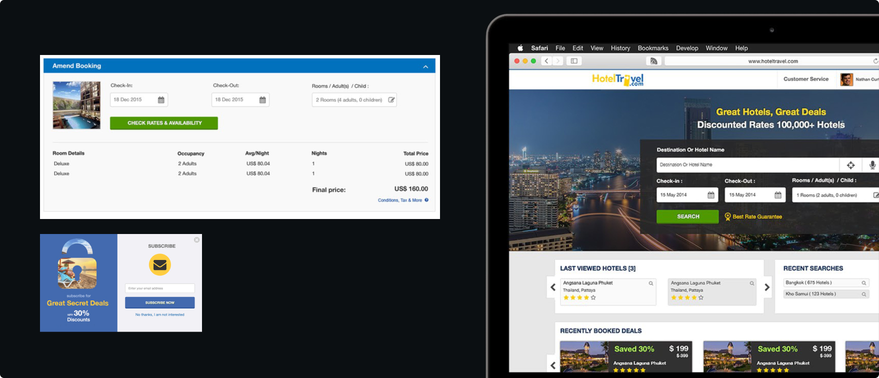
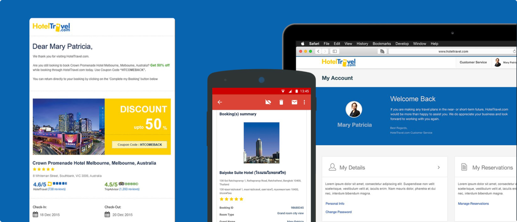
The original focus was conversion, but support data from the call centre and sales team told a bigger story: users didn't just struggle before booking, they struggled after. So we extended the scope into the manage-booking experience and post-booking email communication. This reduced support dependency and improved overall user confidence.
Accessibility
Supporting 11 languages, including Arabic, meant treating right-to-left layout as a core design constraint, not an edge case handled late.
- —Mirrored layouts and interaction patterns for RTL markets, and tested them with real language content instead of placeholder text
- —Worked with engineering so RTL and localisation fixes rolled out consistently across the 300,000+ dynamically generated pages, rather than page by page
The result was clarity that held up in every market we shipped to, not only the ones we tested first.
Impact
The phased approach meant impact could be measured continuously, not guessed at after a single big launch.
Conversion
+2–3%
PDP-to-booking conversion improvement across key markets during phased rollout.
Scale
11 languages
A more consistent experience across global markets, including RTL support, without maintaining separate layouts.
Experimentation
2-week cycles
Controlled A/B testing made changes measurable, reduced rollout risk, and built stakeholder confidence.
Platform complexity
300,000+
Dynamically generated pages supported through reusable patterns, clearer templates, and better consistency across markets.
While exact figures are no longer available, the pattern was clear: better clarity led to better conversion.
Reflection
This project fundamentally changed how I approach UX. I learned that entry context matters more than persona.
A user arriving from TripAdvisor behaves differently from one arriving via search, even if they are the same person. One is verifying. The other is exploring. Since then, I anchor my design thinking in three core questions: where users come from, why they arrived, and what they need to decide.
The second lesson was about execution. On live revenue systems, ideas don't build trust, outcomes do. Trust is earned through validated changes. The first successful A/B tests didn't just improve the product. They changed how the team made decisions.
Continue Exploring
Explore more work
Home
Back to portfolio overview
Return to the main work selection page.
Also View
Enterprise UX at Allianz
A multi-market enterprise case study focused on workflows, scale, and accessibility.
Next Read
WoahBiz Growth Platform
A product case study focused on CRM architecture, campaign workflows, and small business usability.