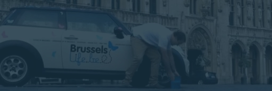
BrusselsLife
Improving Content Discovery and Business Visibility in a City Lifestyle Platform
Platform
A leading city lifestyle and editorial platform in Brussels, combining local articles, curated recommendations, and business listings to connect people with the city.
Audience
Urban readers exploring Brussels culture, dining, and events across desktop and mobile, alongside local businesses seeking visibility.
Focus
Improving content discovery, simplifying navigation across a large volume of articles, and strengthening the connection between editorial content and business exposure.
Contribution
Led UX and product design to improve information architecture, streamline user flows, and enhance content discovery. Focused on making navigation more intuitive, reducing friction in finding relevant content, and improving how businesses are surfaced within the platform.
Source Files
Context
BrusselsLife is a lifestyle and city guide platform focused on events, culture, dining, and local businesses in Brussels. The website publishes editorial articles alongside business listings and local recommendations, attracting thousands of readers looking to explore the city.
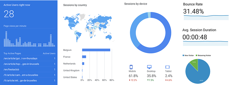
At the time of the project, the platform had been online for more than a decade and had accumulated a large content library and steady daily traffic of around 5,000 visitors.
The platform's business model relied not only on editorial content but also on paid business profiles and sponsored listings, allowing local businesses to promote their services within the platform.
The goal of the redesign was to improve the digital reading experience while also making it easier for readers to discover relevant local businesses.
The Challenge
Over time, the platform had grown organically, which created several usability and engagement issues.
User behavior data revealed a few key challenges:
- A large portion of traffic landed directly on article pages via search engines and social media.
- MMore than 60% of users were browsing from mobile devices., but the reading experience was not optimized for smaller screens.
- Some sections, particularly business pages, showed high bounce rates.
- Search functionality was underused, indicating potential discoverability issues.
- Returning visitors were declining, suggesting the experience lacked long-term engagement.
At the same time, the platform relied on paid business listings as an important revenue stream, but these listings were not always effectively integrated into the user journey.
The challenge was therefore twofold:
- Improve the content discovery experience for readers
- Increase visibility and engagement for local business profiles
The redesign needed to support both editorial storytelling and the platform’s commercial model.
My role
I worked on the UX and product design for the redesign of the BrusselsLife platform.
My responsibilities include:
- Analyzing user behavior and existing site data
- Defining key user flows for content discovery
- Structuring the information architecture
- Designing wireframes and interaction flows
- Creating high-fidelity interface designs
- Conducting usability testing with real users
- Refining the experience based on user feedback
The goal was to create a digital experience that balanced reader engagement, content discovery, and business visibility.
Design Approach
Rather than focusing only on visual changes, the redesign focused on improving how users move through content and discover relevant information.
Content discovery
Since many users landed directly on articles, the article page was treated as a central entry point. The design encouraged further exploration through:
- related articles
- category navigation
- editorial recommendations
This helped transform a single-article visit into a longer browsing experience.
Structured navigation
Content categories were reorganized into clear sections such as:
- Fashion
- Culture & Lifestyle
- Technology
- Video
- News
This improved the clarity of the site structure and made it easier for readers to explore topics.
Integrating business content
One key objective of the redesign was improving the visibility of paid business profiles.
Instead of isolating these listings in separate directories, they were integrated into relevant editorial contexts. For example, local businesses could appear alongside articles related to their category, increasing both relevance and visibility.
This approach created a more natural connection between editorial content and local recommendations.
Rapid ideation and prototyping
Early sketches were used to explore layout concepts quickly before moving to mid-fidelity wireframes and high-fidelity designs. This iterative process helped refine the layout and content hierarchy before development.
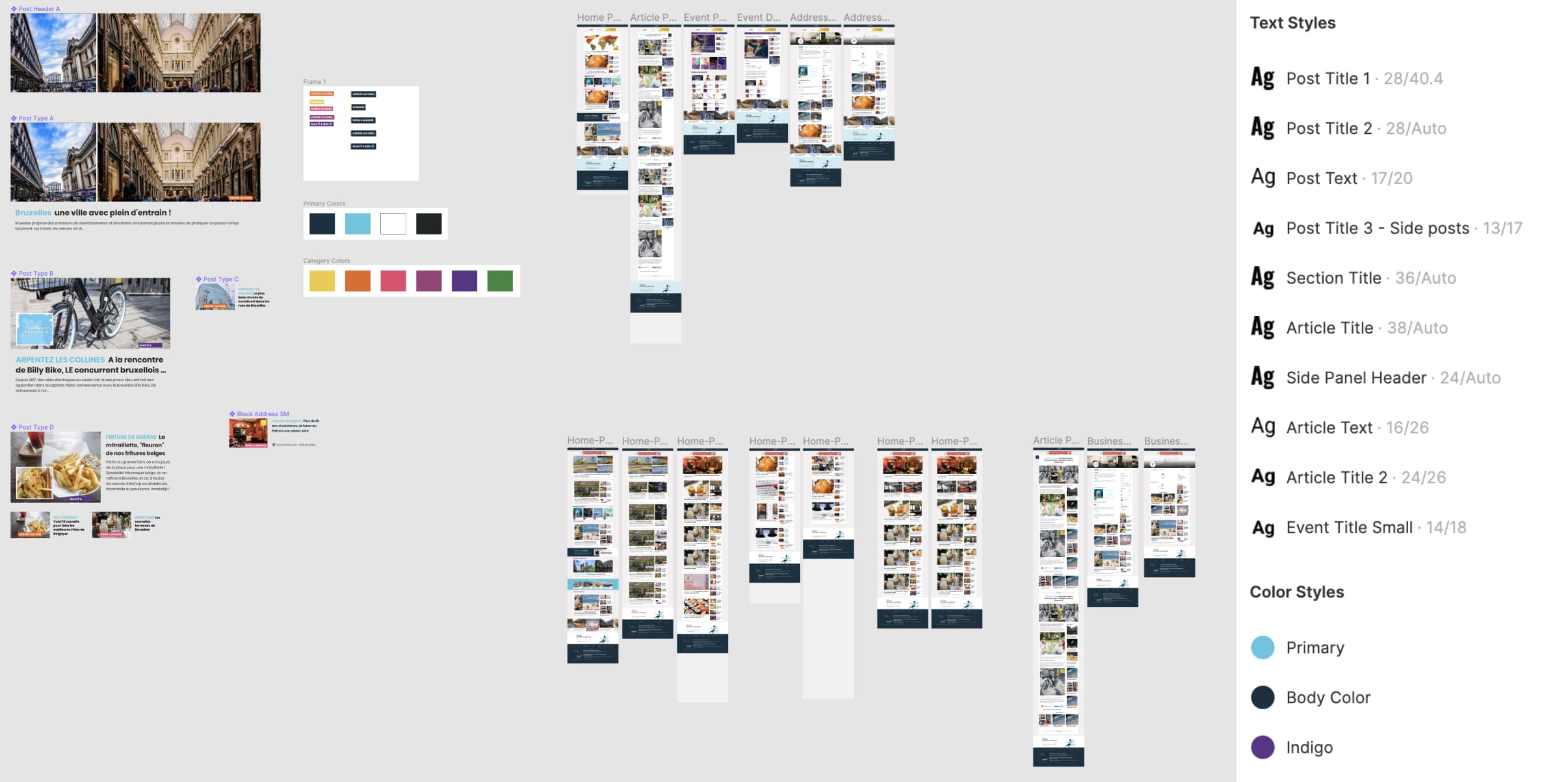
Accessibility Integration
The redesign focused heavily on improving readability and navigation, especially for mobile users.
Key focus areas included:
- mobile-first layouts
- improved typography and article hierarchy
- better visual grouping of editorial and business content
- clearer navigation between categories and articles
- improved scanning and readability for long articles
Usability testing sessions helped identify confusing elements such as oversized content blocks and unclear navigation patterns. These insights informed several layout adjustments before finalizing the interface.
Impact
The redesign improved both user engagement and the platform’s commercial performance.
- Bounce rate reduced by approximately 6-10%
- Longer average session duration
- Improved user retention
- Ad revenue increased by 15-30%
- Increased inquiries to business profiles
By improving content discovery and integrating business listings more naturally within the reading experience, the platform was able to support both user engagement and revenue growth.
Reflection
This project highlighted the importance of designing editorial platforms with both user experience and business objectives in mind.
Readers visit digital magazines primarily for content, but thoughtful UX can also connect them with relevant local businesses and services.
Working on this redesign strengthened my understanding of:
- content-driven UX design
- editorial information architecture
- balancing editorial storytelling with monetization
- using analytics insights to guide product decisions
The project demonstrated how strategic UX improvements can enhance both reader engagement and platform sustainability.
Continue Exploring
Explore more work
Home
Back to portfolio overview
Return to the main work selection page.
Next Read
Enterprise UX at Allianz
A multi-market enterprise case study focused on workflows, scale, and accessibility.
Also View
WoahBiz Growth Platform
A product case study about simplifying CRM and marketing tools for small businesses.